


This book is about the roman type used in Venice by Nicolas Jenson, one of the most successful 15th-century printers. Jenson was well-known among his contemporaries because of his success as a printer/publisher and because of the quality of his type.
His editions featured several rotundas, and notably, a roman which can safely be considered as the prototype of virtually all roman types up to the present. Jenson’s roman has been highly praised in the past and was used as a model for several type revivals by early 20th-century private-press printers. However, the importance of this type in the development of our typographic letters has not yet been sufficiently recognised.
The volume aims to draw attention to this important type and to its maker with fresh bibliographical information and photographic analysis of the letterforms. The type is thoroughly analysed, the career of Jenson is sketched, and discussions on type-making techniques and the origin and development of its letterforms are presented.
Finally the influence of Jenson’s design is illustrated. This will show how his specific design choices were picked up by such punchcutters as Francesco Griffo and Claude Garamont, and became the standard for roman lowercase up to our times.
Images will play a pivotal role in this richly illustrated book. These visualisations allow readers the opportunity to explore the data and examine both the broader context and finer details, and systematically follow the discussion while verifying the reliability of the analysis results.
Text, photographs and book design by Riccardo Olocco. Preface by Lotte Hellinga
Potrebbero piacerti anche
-
Building Bridges
23,00€ + nel carrello
-
Melodramma
24,00€ + nel carrello
-
Now More Than Ever. Typographic Posters On Kindness From...
29,00€ + nel carrello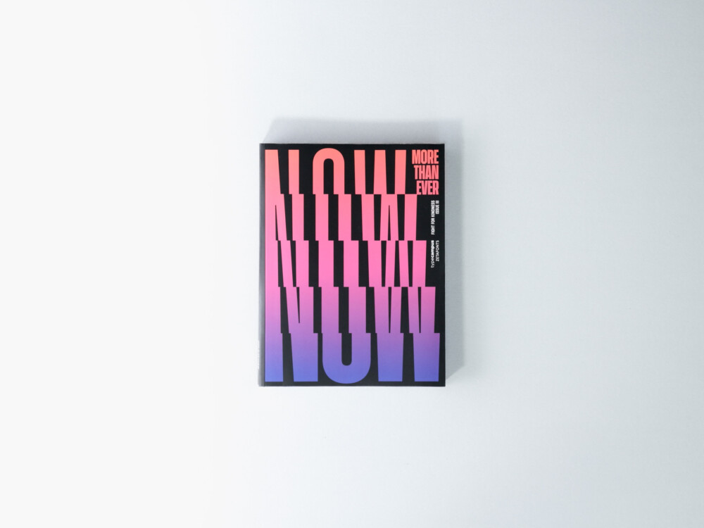
-
Il Disegno del Carattere. 1460-2014
29,50€ + nel carrello
-
Invisible
58,00€ + nel carrello
-
Fuochi d'Artificio
19,50€ + nel carrello
-
Una Storia Lunga Come
19,00€ + nel carrello
-
Limousine
32,00€ + nel carrello
-
Civiltà dello Sguardo
24,50€ + nel carrello
-
Do the Write Thing
49,00€ + nel carrello
-
Early Works: 1964-1984
45,00€ + nel carrello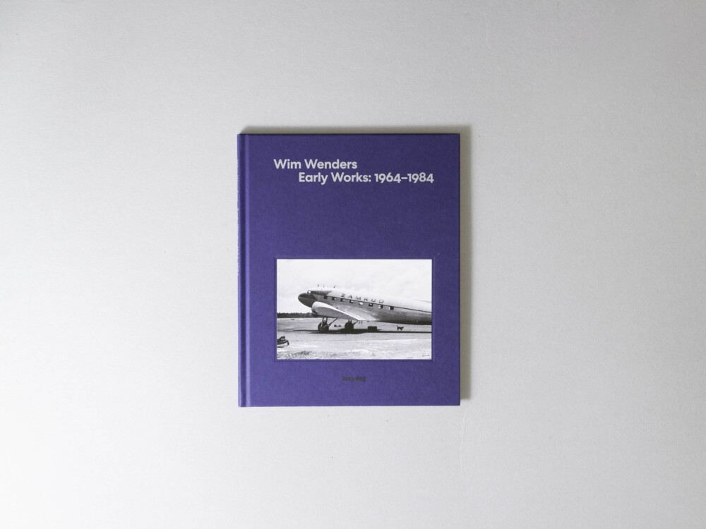
-
Ramonika
38,00€ + nel carrello