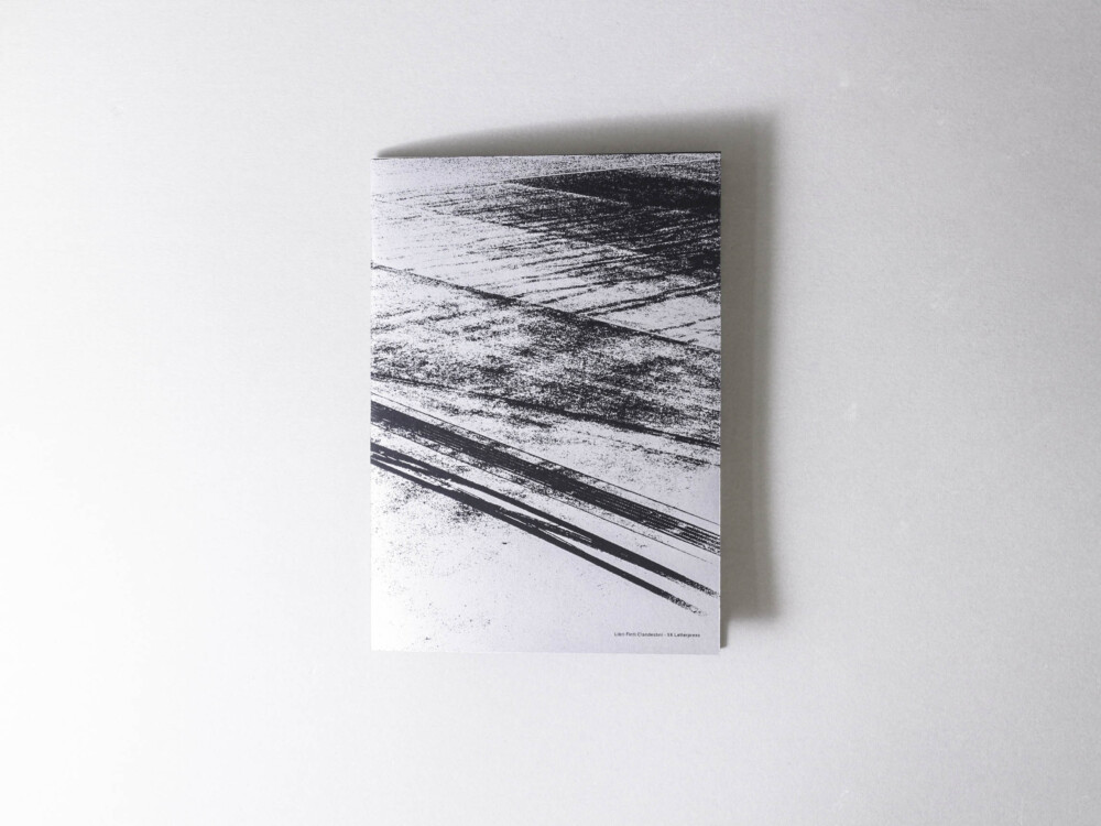
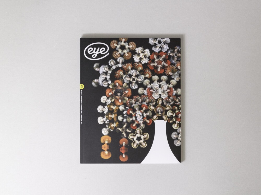
The Slanted team went to Amsterdam to check out the design scene and fell for the charm of the city’s century-old “bruine kroegen” (brown cafes). Seeking refuge after bike rides to design studios, they were quickly won over by the cozy ambiance, dark wood, old-fashioned decor, and the aroma of fried croquettes. Color and form play an important role in Amsterdam’s design, which is egalitarian and serves the masses. Design is ubiquitous in Amsterdam, from the bike path to the police cars and even the city crest. The maze of canals and the upcoming neighborhoods are characterized by muted tones, dominated by black cobblestones, and dark brick. Behind the facades it rattles. The Dutch have always let it rip. The orange is more intense, the red more luminous, the black more brutal. Design is radical, it crashes, it vibrates. There are few places where color and form play such an important role. Design is innovative, modern, functional, and spiced with a pinch of humor. Design is about egalitarianism, not reserved for the wealthy elite. Design serves the masses. And so it happens that everything is professionally designed. The bike path, the kebab stand, the tax return form, the police cars, the park benches and trash cans, the vegetables. In its 41st issue, Slanted gathers a selection of Amsterdam’s most brilliant minds and provides deep insights into their work and values in the magazine and in the numerous video interviews. Illustrations, interviews, essays, and an extensive appendix with many useful tips and an overview with the best Dutch writings complete the issue thematically.


